Beyond the Static Screen: Unleashing the Power of Interactive Digital Signage
But what exactly makes interactive digital signage so beneficial and how does BrightSign make it easy? Let’s explore:
 Amplified Engagement and Memorability:
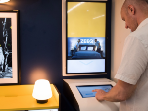
Imagine walking past a screen that responds to your presence, allowing you to tap, swipe, and explore. This is how we engage day to day with our phones, and it’s become the standard when it used to seem like science fiction (think Minority Report). By actively involving users, you capture their attention in a way static displays simply can’t. This heightened engagement leads to better information retention and a more memorable experience with your brand or message. Think about browsing a digital product catalog on a touchscreen versus glancing at a printed flyer – which are you more likely to remember?
Richer Data Collection and Insights:
Interactive displays offer a goldmine of data. You can track what content users are most interested in, which buttons they tap, and even gather valuable demographic information (anonymously, of course!). This data provides invaluable insights into audience behavior, allowing you to refine your content, optimize your messaging, and make more informed business decisions. Imagine understanding which products in your digital showroom are getting the most attention – that’s powerful information!
 Personalized and Relevant Experiences:
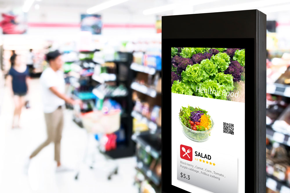
Static signage delivers the same message to everyone. Interactive signage, however, can be tailored to individual needs and preferences. Through touchscreens, QR code scanning, buttons, connected apps, or even motion sensors, you can offer personalized content, targeted promotions, and customized information. This level of relevance makes the experience more valuable and increases the likelihood of conversion or desired action. Think about a digital wayfinding system that adapts based on your selected language or a retail display that suggests products based on your previous interactions.
 Streamlined Information Delivery and Self-Service:
Interactive kiosks can empower users to find the information they need quickly and efficiently, reducing reliance on staff. From wayfinding in a complex building to accessing product details in a store or checking in for an appointment, interactive signage provides convenient self-service options. Most people are used to shopping online, so extending that experience to a retail location where they can lay hands on the product is the next evolution. This not only improves the user experience but also frees up your team to focus on more complex tasks.
Enhanced Marketing and Sales Opportunities:
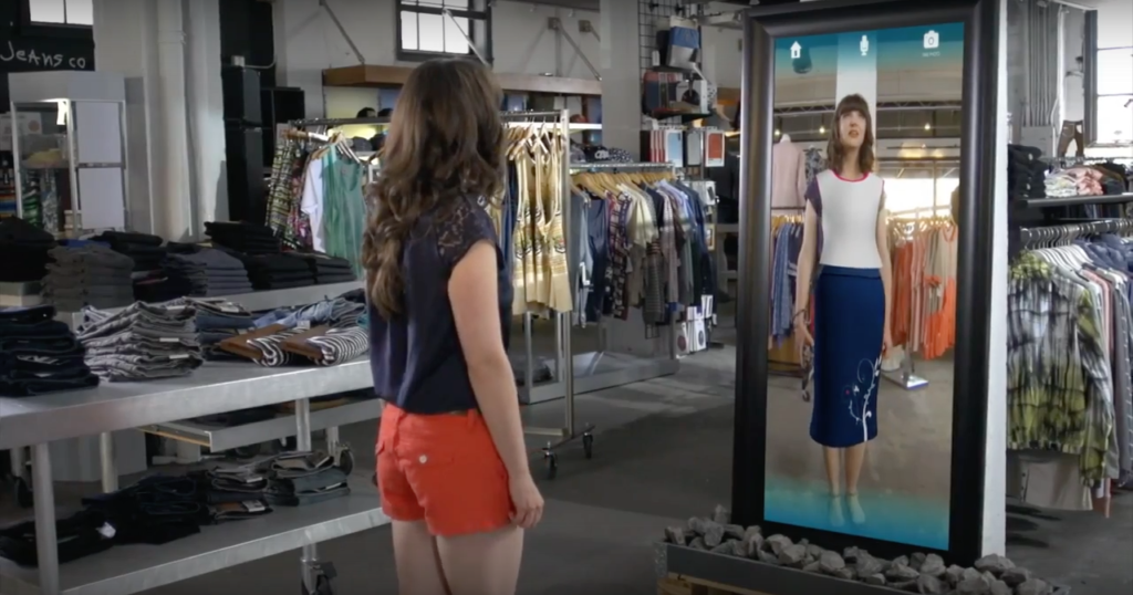
Interactive digital signage opens up exciting new avenues for marketing and sales. Imagine a digital storefront that allows customers to browse products, view detailed specifications, watch videos, and even make purchases directly from the screen. Interactive displays can also be used to run engaging contests, collect leads, and deliver targeted advertising based on user interactions.
How BrightSign helps move interactivity forward:
BrightSign’s free software, BrightAuthor:Connected offers a drag and drop approach to “programming” interactive content, opening the door to those that may not have the technical capabilities to create content using HTML and Javascript. These tools offer the ability to create interactive content for use with touchscreens, control systems, fire alarms, buttons, motion sensors, keyboard, card readers, GPS sensors, etc. without the need for programming knowledge. In the video below, I create an interactive presentation with touch, UDP and button control, including a playback counter, all in around 2 minutes.
The Future is Interactive:
Interactive digital signage is more than just a trend; it’s a fundamental shift in how we communicate and engage with audiences in physical spaces. By moving beyond static displays and embracing the power of interaction, businesses and organizations can create more engaging, informative, and ultimately more effective experiences.
To learn more about interactive signage and how BrightSign can help, contact me at [email protected], or visit our website AlmoProAV.com for additional information.
If you enjoyed this blog, check out Todd’s earlier blog “Monetizing Digital Signage.” and watch his “Getting Started with BrightSign | Digital Signage Management 1st Steps” tutorial on YouTube.

Todd Heberlein | CTS, DMC-D-4K, DSCE
Senior BDM – Technical Lead
Supported Manufacturers: Absen and Brightsign


